Relaxin weekend.

Lindsay and I ended up taking it easy for the most part this weekend. Caught Dreamworks Animation screening of Flushed Away. The teams who worked on the film did such a wonderful job. It was great to see the names of some of the animators I work with at the studio, and to see their shots up on the big screen. Also while waiting to pick Lindsay up at the airport I did a few sketches.

We decided to hit up Disneyland again on Sunday just to get a few rides in. We also tried out the "how to draw Disney characters." Sadly we left without our drawings, but we were instructed on how to draw Donald.(Where I also learned that he has been in the most animations of any Disney character...) Next time we shall save the drawings.

Tonight after getting in from the park I did a quick tweak to that bouncing ball with a leg test. I tweaked the ending so that he lands toe, to ball then heel. Then added a little hop back, sense today there was this kid at the park who jumped off a railing and hopped back due to his landing. Thought it might be something to add in. So after a few mins of messing around. Here it is.

One down and One more to go!

Just got word that Lindsay got her contract extended until march. Which is great sense it will take her through the entire Subs project! I'm sure she has a long career path ahead of her up there. Great work darlin!

San Fran 10.20-22

Getting back in from a wonderful weekend up in San Francisco with Lindsay. Got to meet up with Meng, and Nara for a late lunch. HAPPY B-DAY TO MENG! Did a few quick sketches while relaxing around different areas of San Fran. Now I'm off to play me some Tetris DS for the night.

A try at some contrast.

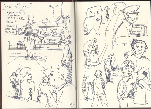
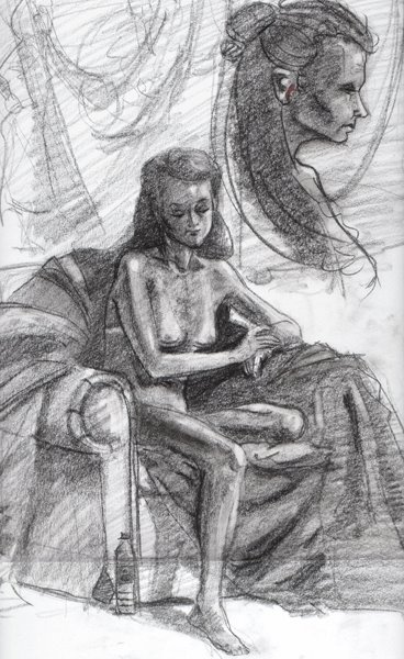
Here is what I did tonight during figure.

Searching for contrast.

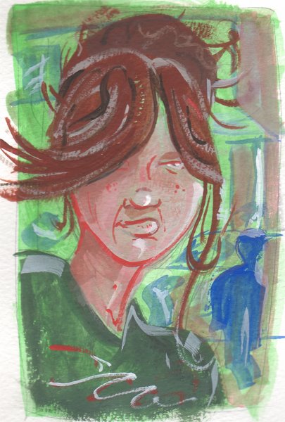
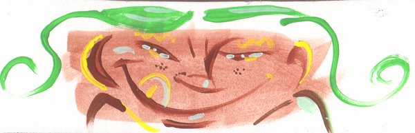
Well tonight I decided to just do some digital drawing/painting...Alas I always seem to end up with image that has low contrast. Usually my work method is something like this:

Poor use of background + Low contrast = Visually boring image.

So, just for fun I copied and layered stuff together, inverted and many other things to see what other contrast combinations I could get. I see that Guillermo is doing just straight gray scale paintings and I'm thinking I might have to do that. I need more contrast in my images to help sell the poses of the characters. Granted I have seen artists make some amazing images with very little contrast to them. I guess I'm just looking for it in my own stuff at the moment. Chris gave me a couple good examples of still life's in mono or close to mono chromatic paintings at work a few days ago. Anyways enough rambling here is what I have thus far.


CONGRADS TO LINDSAY!

Got word today that Lindsay just got her first chunk of subs finaled up at Pixar! Good work darlin, I knew ya could do it. I'll keep you all up todate on her progress up there as the months progress. We both have our contracts up in December for renewals...So wish us luck.

Disneyland.

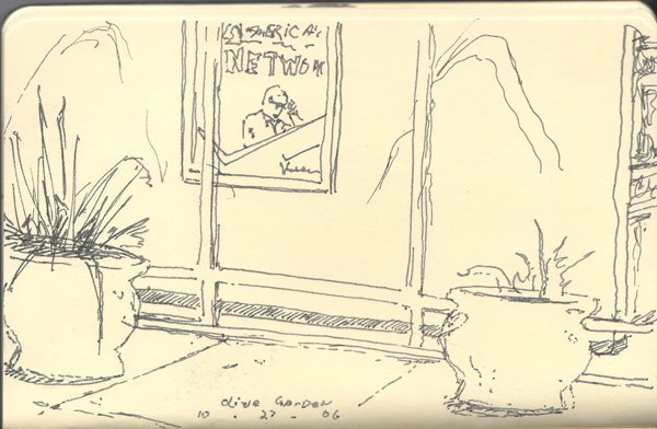
Well just finished up a great weekend over at Disneyland with Lindsay. Her and her team got to fly down to see the construction site of the new Finding Nemo ride called Finding Nemo Submarine Voyage. It should open sometime in the summer of 07 I believe.(Best to check Disney's site for up todate info on the rides schedules and such.) I know she and her team were extremely excited to see it all coming together down there. I personally can't wait to ride it!

Also coming out this week is Dreamworks Animation's Over the Hedge (Oct 17th)! (Note I didn't work on Over the Hedge)

Its been a very exciting time for Lindsay and I being at our jobs. Its so much more then we could of asked for coming right out of school. We are learning so much and are working as hard as we can so that our teams keep us animating for more projects to come.

And so it begins.

My jump into the world of color that is(Don't laugh at the paintings too much hehe). It has been fun, but also very tough getting workflow, color theory, and materials going. I do feel that I'm finally at a point now where I can take on this side of art, and try to develop it for some fun expression, and dare I say art for art sake...

I have come across these two artists and have been taken with their uses of shape, color and contrast. Scott Morse's style is wonderful! (I have been following his work for style) Great shapes, fun designs and the colors really add some life to his layouts. Also Hiroshi Yoshida's landscapes are great uses of color. So for the past couple weeks I have been looking to these guys for some inspiration and education.

I hope to keep pushing forward with painting and getting a better grip on its uses. I have to say thanks to Chris and Jason for helping me get going on this stuff as well.